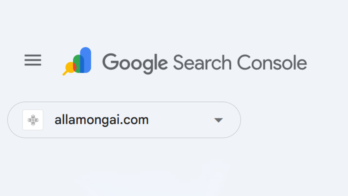
Today, Google surprised the SEO and webmaster community by rolling out a fresh new logo for Google Search Console (GSC)—a tool essential to millions of digital marketers, publishers, and site owners.

The updated GSC logo is now live across the interface, replacing the old “toolbox” design with a vibrant, modern emblem that better aligns with Google’s current visual ecosystem. The new icon integrates a colorful bar chart and magnifying glass, symbolizing performance insights and diagnostic capabilities—core to what Search Console offers.
Why the Change?
According to one of Google’s post, the redesign is meant to better reflect Search Console’s mission to help publishers grow and optimize for search. The logo features Google’s signature palette—blue, green, yellow, and a touch of red—while clearly incorporating elements that represent data and search.
“The toolbox served us well for years,” Google wrote, “but it’s time to evolve. We needed something that reflects how GSC empowers creators to understand and improve their presence in Search.”
This marks a major visual refresh and perhaps a signal that Google may roll out further enhancements to the Search Console experience soon.
A Closer Look at the GSC Logo
The new GSC logo combines:
- A bar chart symbolizing data insights
- A magnifying glass to reflect problem detection and SEO diagnostics
- Google’s trademark colorful branding
This aligns GSC visually with other Google tools like Analytics, Ads, and Search Central, reinforcing the theme of brand consistency across its suite.
What the Community Is Saying
The change first gained attention when Dhruv Pandya spotted it and shared it on X (formerly Twitter). Users quickly noticed the live update in their dashboards, sparking conversation and speculation—especially since no official blog post accompanied the switch.
While some suspect a soft rollout or a test phase, the logo is already widely visible and fully integrated into the Search Console interface.
Here’s how it now appears on your dashboard:
Why This Update Matters
Though seemingly cosmetic, the Google Search Console logo update reflects deeper branding and UX intentions:
- Emphasizes GSC’s role as a data and diagnostics platform
- Strengthens its identity within the broader Google ecosystem
- Reaffirms Google’s commitment to visual clarity and user experience
With Search Console playing a vital role in SEO, index monitoring, and website health, any visual change quickly gets noticed by professionals.
The GSC New Logo Update is more than a rebrand—it’s a message. Google continues to innovate not just with algorithms and features, but with how users perceive and interact with its tools. As visual identity becomes increasingly tied to function, this change makes perfect sense.
So, what do you think of the new look? Let us know in the comments below and stay tuned—because if history is any guide, visual updates often precede functional upgrades.
Do you love the fresh new look of the Google Search Console logo, or do you miss the old toolbox icon? Does this change make the platform feel more modern—or was it better before?
Drop your thoughts in the comments below!
